Print materials
The following files were built in Adobe Creative Suite products, which are the industry standard for professional printing. If you'd like to use different software, you can use the PDFs as a guideline. Be creative! But as a general rule, follow these guidelines:
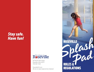
- Limit your font usage to the guidelines on the Typography section of the styleguide. Sometimes custom fonts are a good idea. For example, see the sample brochure cover for the Splash Pad. When that's the case, avoid using alternate fonts too heavily and make sure you have a good reason to do so.
- For brochures and flyers, avoid clipart and illustration, and lean toward large, colorful photography. Professional photography of real people and real events is always preferred, but if that's not possible you can buy fairly inexpensive stock photography at bigstockphoto.com or istockphoto.com.


